Research &Development
Research Stage
Mood Boards and Contextual Research
I started by collecting reference images for the kinds of dragon I wanted to base my model on, I wanted to try and create a more traditional looking Japanese dragon with varied textures. Ideally my dragon will be easily identified and have a bright stylistic design. The brief states te my dragon needs to have a large menacing face, sharp teeth and claws, scary eyes and defined features/musculature. It doesn't state that the dragon needs wings so I've gone with a dragon the flies easily without wings.

I wanted to understand the context for this style of dragon concept, from researching online I've been able to find out:
-
Japanese dragons are known as Ryu or Tatsu, they are one of the four creatures from the heavens in Japanese Mythology (the others being a Phoenix, turtle and Tiger)
-
They are part of the Japanese spiritualism known as Shintoism
-
The term Tatsu specifically refers to a water dragon god/spirit, these creatures reside within rivers, rainfall and oceans.
-
Japanese dragons differ from traditional Chinese dragons in that they only have three toes, whereas Chinese and Korean depictions have more (around 5). This is possibly due to the belief that the further the dragons travel from their home, the more toes they grow.
-
Japanese dragons often sit atop gateways to temples, shops and shrines as a symbol of the struggles of man to achieve
enlightenment. - There are specific dragons that represent Luck (Fuku Riu), Revenge (Kiyo), Seas/Oceans (Ryu Jin), Famine (O Goncho) and other prevalent stories or events.
- The representation of the dragon below is thought to be Yamata-No-Orochi, a fierce eight headed dragon with a belly covered in blood and a mossy back/tail.

The dragon has three toes with fearsome claws, they resemble other lizard/avian creatures.

This Japanese dragon has a ribbed belly that expands and shrinks to fit the width of the overall shape/scale.
There are scales covering the back, a crest of fur peaks out along the spine and runs the length of the dragon into a long tail.

These images are all of real creatures that have features closely related to my mythical dragon. There are a mixture of reptiles like lizards (Komodo Dragons, Iguanas etc...) as well as snake scale textures and even birds/bats to study their talons and wing shapes. It's important to find real world references as they can help ground the 3D model in reality, in most mythological creatures, elements of real ones can be found. this ultimately helps our minds to understand the physiology of the creature better.
I've looked into the physiology/skeletal systems of snakes more than birds and bats as the Japanese dragons do not usually have wings and move more like serpents in the air.
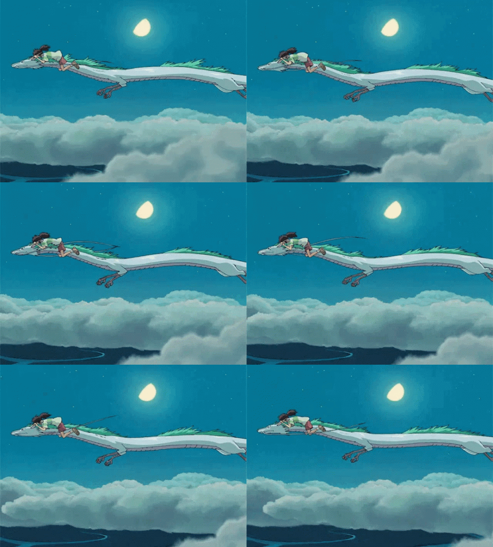

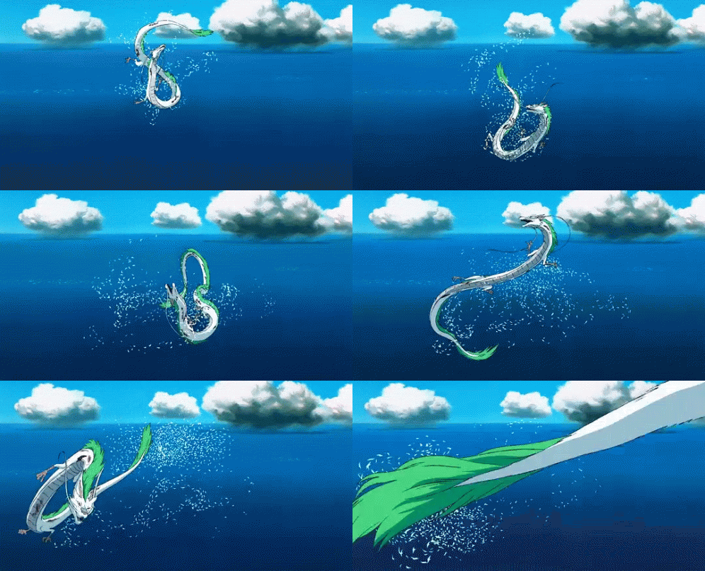
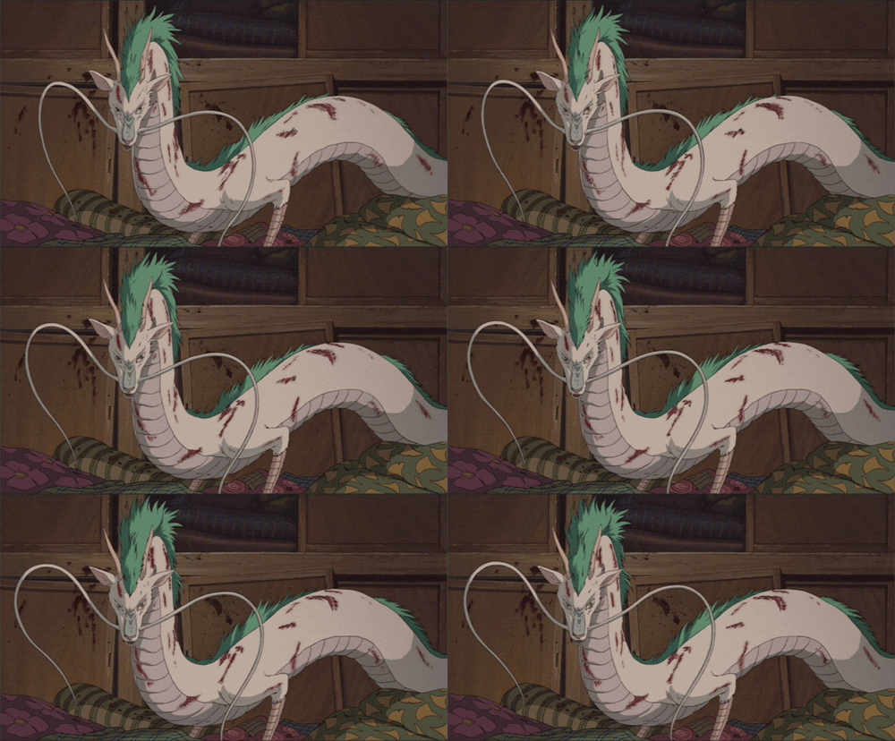
This Japanese dragon character is called Haku, he's a River Spirit dragon featured in Studio Ghibli's Spirited Away (2006).
The way this dragon moves is much closer to a serpent than a bat or other winged creature, I need to remember this when creating my dragon and create a pose/stance that reflects my dragon's structure, physiology and personality.

3D Clay Modelling from my Reference Drawing
Blender 3D Model Development
I started my model by drawing a spline path, I extruded out each point using my reference drawing until I had the basic shape of the dragon. I then went into the properties panel and adjusted the depth and weight of the spline, I converted this path into a mesh that I could manipulate more easily. The NURBS/Spline method worked well as the dragon is an organic shape, it would have been much harder to complete using a box building method (although I tried this out for a practice model early on in development). For more rigid objects like buildings or machines/vehicles it makes sense to use the box method, later on in the build I did use a cube as the base for my dragon's head which worked well.


Once I'd extruded the spline out and tweaked the mesh a bit, I decided to shape it to fit the musculature and style I'd drawn/imagined. I wanted a ridge at the top of the mesh to allow for the spine and fur detail to be added. I deformed the cylindrical shape slightly and made sure to keep both sides similar, unfortunately the mirroring didn't quite work so it's not totally symmetrical- I will ensure next time I master the mirroring settings as it would have made attaching limbs later on a bit easier. I tried to stick to the reference image where possible as it's easy to get side-tracked making alterations.
I started on the limbs quite soon afterwards, I created them from cylinders which I extruded at angles and rotated to create joints. At this point I should have checked the subdivisions compared to my main spline. As there were far fewer subdivisions in the legs it would be tricky later on to attach them to the body. I did have to change the subdivisions when forming the feet/claws

I created the feet already attached to the legs to try and avoid having to match up different polys, I mainly used extrusion tools and scaling to form each toe, the main base of the foot isn't particularly detailed but i did reshape it slightly to be longer.


Once the body and feet were finished, I needed to create a head. I tried to sketch out the rough shape and details that I'd need to sculpt, then using these reference drawings I was able to extrude out a basic head shape from a cube mesh. I paid close attention to the scale of the face compared to the body as I wanted it to look correct. This technique started as box modelling but I went in to more detail with polygon building/connecting and finally a subdivision and sculpt later on.


I attached the head to the body manually as opposed to letting the software calculate the solution. This meant that I could check each vertex/edge was connected correctly. I had to play with the rotation of the head and position until I was happy with it.
The eyes are separate spheres with a higher poly count to seem more spherical, similarly with the hair/whiskers I created these separately using splines (like the body) and attached later on.
Once I'd attached the head, I had to make sure all the faces were joined, there were a few issues with the underside of the neck and head but I was able to work around this. Next I added more detail to the claws and general positioning of the dragon to look menacing. The pose I chose is common with Eastern Dragon sculptures from my references and other artworks.

I highlighted the model and created a UV map in Blender to see if it would be able to export out to Mudbox (AutoDesk) for sculpting. As there were a few tri's among the quads and edges connected to more than one vertex It was tricky to use Mudbox. I also found that changing over controls and learning new hotkeys in Mudbox quite time consuming after using Blender for the rest of the build- this is something I aim to get better at over time.
I also had a few issues importing the FBX file as it wouldn't show up in Mudbox's viewport straight away and was a difficult scale/clipping range to work with. I was able to alter the polycount correctly in order to export my UV map/model so it could be suitably changed in Mudbox for sculpting, however I ended up doing this through Blender.
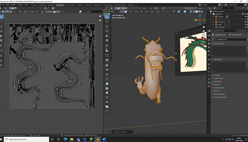
I decided to persevere with Blender's sculpt mode and used a few built in sculpt brushes to extenuate the dragon' spine, this would give him the look I wanted and prepare him for some added spines of hair later on in the build. I removed the eyes temporarily in order to sculpt the dragon's brow/facial fur.
Before sculpting I made sure to add a subdivision surface modifier in order to increase my low poly model to a more detailed version that would be easier to model on top of.

This gallery shows the difference in polycount for my dragon before and after adding the modifier, I had to make sure not to subdivide too far as it started to become too complex and difficult to navigate in the viewport (mostly due to processing power needed and calculating I think). I was happy with two levels of subdivision, taking the face polycount to around 258,000 total. I then experimented with a few different brushes made from jpgs/pngs/psd files of different varying scales/skin patterns. I downloaded these online and also experimented drawing my own but it was difficult to get a good result due to the layout of faces on the main body spline. The legs however picked up the pattern much more effectively. After a lot of experimentation with strength of brushes, minimum size and topology I settled with a crocodile skin style brush, the black and white ratio in the image seemed to work better with the shape of my dragon's mesh. I'm sure as I learn more about how to texture paint, I will be able to solve these issues and come out with a better end result. I decided to use different shades of colour later on to add more shadow/texture to the model.
Next I was able to start sculpting the main physical attributes and character of my dragon, I knew I wanted to have a menacing open mouth with sharp teeth, branch-like antlers as he's an angry River Spirit dragon that has been awoken by the main game character (final boss fight) and has debris as part of his antlers, I also wanted spines that stuck out of his back, early on I experimented with fur simulation on a cone mesh but due to the way the spines were sculpted in the end, it was difficult to try and add this. I chose to colour the spines separately and try to make them look like fur still- if I had longer I definitely would have added fur effects. I mainly used the snake hook and drawing/layer clay tool. I did play around with the stroke, fall-off and strength of brush in order to achieve an effect I was happy with.


One I'd sculpted the spines and main features, I decided to manually sculpt in each rib on the dragon's stomach, I did this by layering clay material and then adding in creases. I then smoothed over it with a low strength brush to made it seem more natural. In order to stay in the lines I created a seam either side of the rib area. I finally added the crocodile skin texture brush over the rest of the model, making it less prominent around the face/snout.

When adding colour, I highlighted the faces using shift and created new material colours which were applied and adjusted. I found this quite time consuming as there were lots of little polys between gap in claws/on the back that all needed to be included. I wanted to have relatively bright colours and had a green, red, brown and yellow colour scheme from my reference drawings that I was keen to stick to. I also highlighted each crease in the belly ribs which I gave a darker mustard yellow to enhance them slightly. Similarly I used a darker green for the hair tips on the face/head area to highlight them. I decided to do the teeth and claws the same bright white colour but debated adding some blood staining for added effect.
If I had more time I would have liked to have blended the colours more seamlessly together although I'm still happy how it turned out.

I have added in an environment for the render to show my dragon off in his natural environment, I have used free assets from TurboSquid for this.
https://www.turbosquid.com/AssetManager. 2022. [online] Available at: <https://www.turbosquid.com/AssetManager/Index.cfm?stgAction=getFiles&subAction=Download&intID=884791&intType=3&csrf=A2C9D9800F23355D343585EEDF72354726A125DA&showDownload=1&s=1> [Accessed 28 January 2022].
Blankenship, T., 2022. 13 FREE Forest HDRI Environment Maps - 100% FREE from Shutterstock. [online] The Shutterstock Blog. Available at: <https://www.shutterstock.com/blog/free-hdri-environment-maps> [Accessed 28 January 2022].
I added a sphere which I wanted to use as a reflector for a HDR image, this will hopefully complete the scene and allow for better reflections/environment. I had to go into the shading mode and plug in the correct nodes for this to work effectively. The effect of the light emission/reflection on the rest of the environment/scene really helps it look more cohesive than a plain background. I changed the shader nodes to allow the sphere to seem more metallic and less rough, meaning the light would be bounced around the scene and onto my model more efectively.

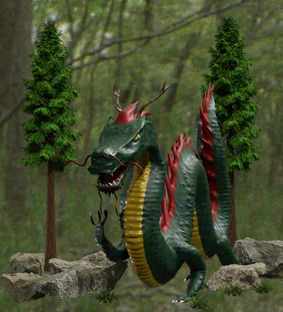
First Render with Background Environment
After rendering out the first image, I sent out a feedback form to gather some data on what con be improved., as well as how well my dragon fits the brief. Here is a selection of the responses gathered:
I agree with the feedback given, I'd love to add more detail to the mesh in order to achieve a repetitive scale pattern. I'm happy that all responses indicated I'd chosen appropriate colours for my dragon, as well as the details like hair, teeth etc...
"I think that moodier lighting would make a lot of difference" - I have since tried another HDR image and moved lighting around. I think that I need to adjust the metallic/roughness nodes in order to achieve a more realistic look to my dragon. Below are further renders with adjustments made.


Second Render with Background Environment
This second render if from a low angle, showing off the scale of my dragon and letting you see from the perspective of the hero who has to fight him. It also means the mouth is more in view as well as the lifted claw ready to attack. I had a bit of difficulty arranging the environmental objects against the background at this angle but am happy with the dragon placement. I adjusted the lighting to try and show off the textured body but the model still looks a little too metallic and smooth compared to a 'real dragon'. I did use two different sun lamps along with the HDR projection which need ot be altered slightly.

Third Render with New Background Environment
In this render I altered the lighting and texture output nodes to try an achieve a less plastic/metallic looking façade. I am really happy with how it came out. (Rendered with Cycles). I was able to position the environmental assets better for this shot as well. I tried a deeper green forest HDR image which I think worked better than the last one. I also made sure that I tweaked the direction of the light to reflect off the antlers and bring more attention to the belly ribs. I made sure the camera was positioned to point at the dragon's eye, adding a bit more drama to the shot.
Feedback I was able to use in my final render:
"Give some more moody lighting to the scene might help the Menacing factor" - I re-lit my model to highlight the area I wanted to show off more.
"The actual dragon is looking great just maybe work on the lighting a little bit to define it more." - The lighting and HDRI have been adjusted for the last render to suit the darker theme.
"Maybe you could add it into a quick environment, maybe just a studio set up to get a nice final render." - I added an environment with background HDRI and 3D imported assets.

CONCEPT ARTWORK AND BACKSTORY
My Dragon is called Mizuchi after the Japanese creature, he's a river spirit who emerges from the forest area to battle our hero character at the final stage of the game. To meet the brief, the dragon needs to have menacing teeth and eyes, sharp claws, scales and suitable musculature. I believe that my model has achieved this and wouldn't look out of place in a videogame.
Evaluating my work:
I really enjoyed the project overall, looking back there are definitely areas of improvement like attaching meshes correctly to avoid issues in sculpt mode/UV mapping and exporting later on. I will remember this for the future. I liked using Blender but will definitely try and use 3DSMax next time as well/Mudbox for sculpting as the level of detail in texture painting is much better looking. I am happy with my reference images/drawings and definitely used them a lot during the build. The feedback I got from my survey really helped me refine my final renders, as well as give me ideas to improve the general look of my work. I thin k I used the correct modelling techniques to create meshes that were adaptable and usable however I now have an even better understanding of the pitfalls and complexities of mesh modelling as well as how subdivision modifiers can help with detailing later on in the build. I aim to work on HDR lighting setups for future builds but have learnt how to project from a sphere and add in 3D downloaded assets (Blend files/FBX). I have rendered all my work in Cycles mode as I believe the quality is much better overall .I have experimented with different nodes like the Noise modifier, metallic/ roughness and sheen to give the desired effect. As the model is an FBX and Blend File, it can be imported into Maya or be rigged in Blender before being used in an animation/part of a game as a movable/posable character. It can be adapted and sculpted to pose for scenes. I would be able to recreate this model in different poses for rigging in future thanks to what I've learnt in this project.


