Spider Walk Cycles
The spider was especially tricky to draw in different poses so I watched videos on how to break down the leg movements. In total there were 12 positions to create which I repeated to create a cycle.


This tutorial helped me to understand the way spiders move without trying to catch one! 2021. https://www.youtube.com/watch?v=GtHzpX0FCFY. [image] Available at: <https://www.youtube.com/watch?v=GtHzpX0FCFY> [Accessed 18 May 2021].
Production Log
Week 1:

This week I was able to mind-map a few ideas for my project, I started by listing media that I'm a fan of. I looked at brands like Ripndip who use bright graphics and animation to showcase new clothing designs, however what I was planning to make would be too similar to what already existed so chose to go in another direction. I next looked at professionally made content like television shows, film franchises and Playstation/PC games I enjoy, I was able to formulate a couple more ideas like creating a piece of concept art, 3D models and environments for a sequel to a pre-existing game or my own creation. Due to the timescale and how long it would potentially take to create a piece of work I'd be happy with I decided to work towards a slightly different idea.
I decided to look at podcasts/independent creators online on YouTube/Spotify that I listen to and try to create animated scenes including the characters. The podcast the really appealed to me was the Sweet Boys Podcast on YouTube run by Garrett Watts and Andrew Siwicki, this is a relatively new podcast with around 14 episodes released so far. The theme of the podcast each week is different but doesn't follow any particular structure, the hosts go off on imaginative tangents throughout and represent their stories with stock footage currently. My aim is to create short animated clips of Andrew and Garrett in the situations they describe with fun animated graphics, characters and environments.
Part of my inspiration for this kind of piece is The Midnight Gospel - An adults animated series on Netflix created by Pendleton Ward (Adventure Time) that takes clips of podcast audio and creates a visual storyline that is in some way relatable/complimentary to the audio. I like the simplistic character design and character movements, the surreal style is something I really want to experiment with and the interview style podcast theme gives me an idea of how I can translate a conversation into complimenting visuals. I am also a fan of Adventure Time and will be studying the movements and colour pallets used. I am going to create a few sketches in the style of Pendleton Ward to develop a similar style for my work.


Primary Research
Research I need to complete for this project will include a look into YouTube analytics, particularly for the podcast channel I am attempting to collaborate with, along with other similar podcasts, animated shorts channels and content that aligns itself with the same sense of humour/imagination. I am hoping to look through comments left on these channels to gain some insight into what the audience likes/dislikes about the format and content. I am also going to research Reddit forums and similar groups online that watch the podcast- here I can even post ideas/ask for feedback on my project. I will be sharing clips from the animation with my peers as the project progresses along with friends (who watch lots of animated content) who can comment on style, colours, movement and flow.
My project will be a series of animated clips using audio from a Podcast on YouTube. I will use the audio to inspire me to create environments based on topics of conversation and characters based on the two hosts. The length of the clips will be determined by how long they are in the podcast, I will aim to make no more than five complete sequences that can be possibly edited into a show trailer. I am also going to experiment with an animated logo that I can use for the title screen. The format will be mp4 and it will be uploaded to my YouTube channel.
The purpose of my project is to create an animated piece for my portfolio, I’d also like to link my work to the podcast channel for them to view, this is standard for “fan made” content based on YouTube content. – I will research Reddit groups for the hosts also as many people submit fan art/work on this platform for feedback from the intended audience.
The main contextual link for this project is the YouTube/Spotify podcast channel I’m using for sample audio- I will be researching similar fan made animation made for other channels and more professionally made content for Netflix/other platforms. The channel I am using as the base for my animation currently represents their ideas and stories with stock footage and audio inserted into the main podcast audio. For the rest of the podcast they are sat in a room with microphones so I hope to elevate this and create clips of animated content that could potentially be used in future podcasts or to advertise the channel’s presence.
My target audience will mostly be made up of viewers of the podcast so I will look into the analytics and find out the average age/nationality range of viewers. I can estimate that viewers would be between the ages of 16-30, mixture of males and females. – Interests in the hosts former channels/collaborations, wholesome content, imaginative/observational humour and improv, popular media and trending news, nostalgia and quirky interests, popular culture.
My idea should fit into Democratisation of Media through technology because I am creating a fan made animation using industry standard software accessible from home and uploaded to YouTube – a site for independent creators to present their work for others to view/entertainment.
I have also taken inspiration from the Ricky Gervais show and Joe Rogan Podcast animated clips although I don't think I'll follow their art style for my own characters.
I have also contacted the sweet boys podcast as a fan regarding the animation
Font Experimentation
I downloaded a few different fonts to see which fitted best with my theme, I will try layering different effects behind the text and animating it to establish which to use for the title. I have chosen cartoonish san serif fonts which communicate to the audience that the show is fun and relaxed. These fonts have now developed into my own drawings with added effects when animated.
Storyboarding and Pre-visualization Practice
I have begun typing up the transcript from parts of the podcasts I want to create visuals for; I keep this as a reference when drawing storyboards to make sure everything is cohesive. These first storyboards are very basic and only hit the audio marks, I will fill in the in-between angles, colours and full characters later on.


Themes Mood Board

Animation Styles
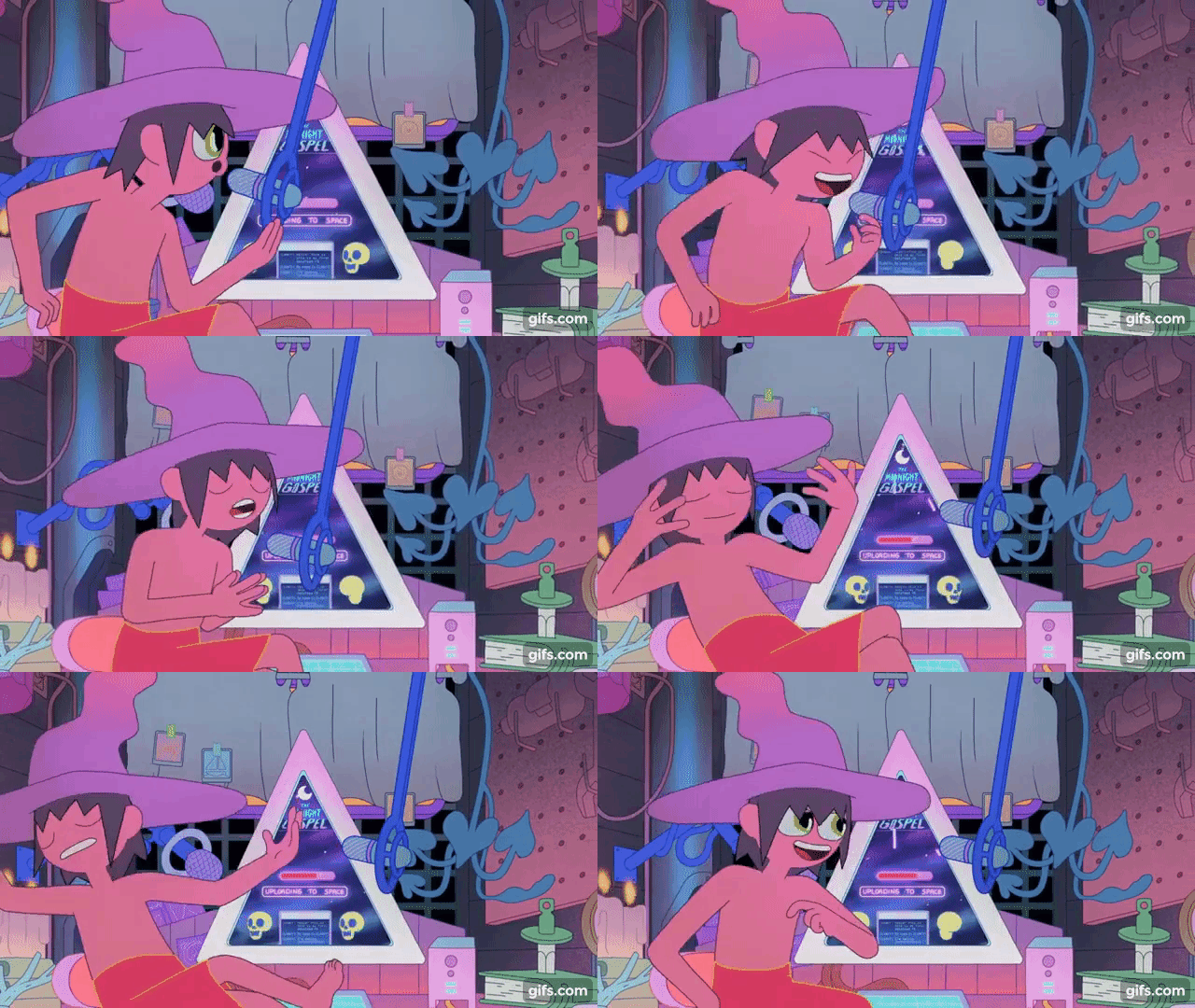
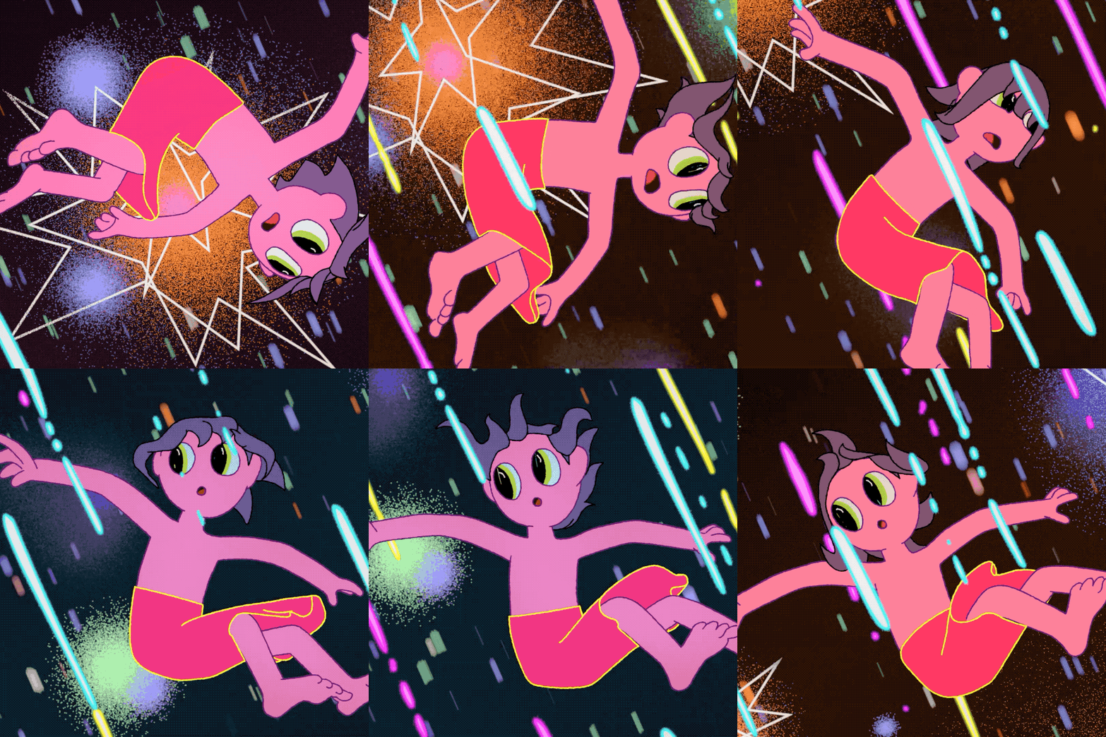
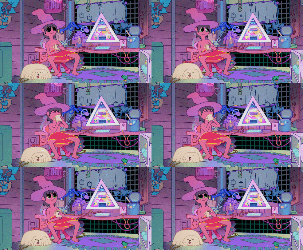

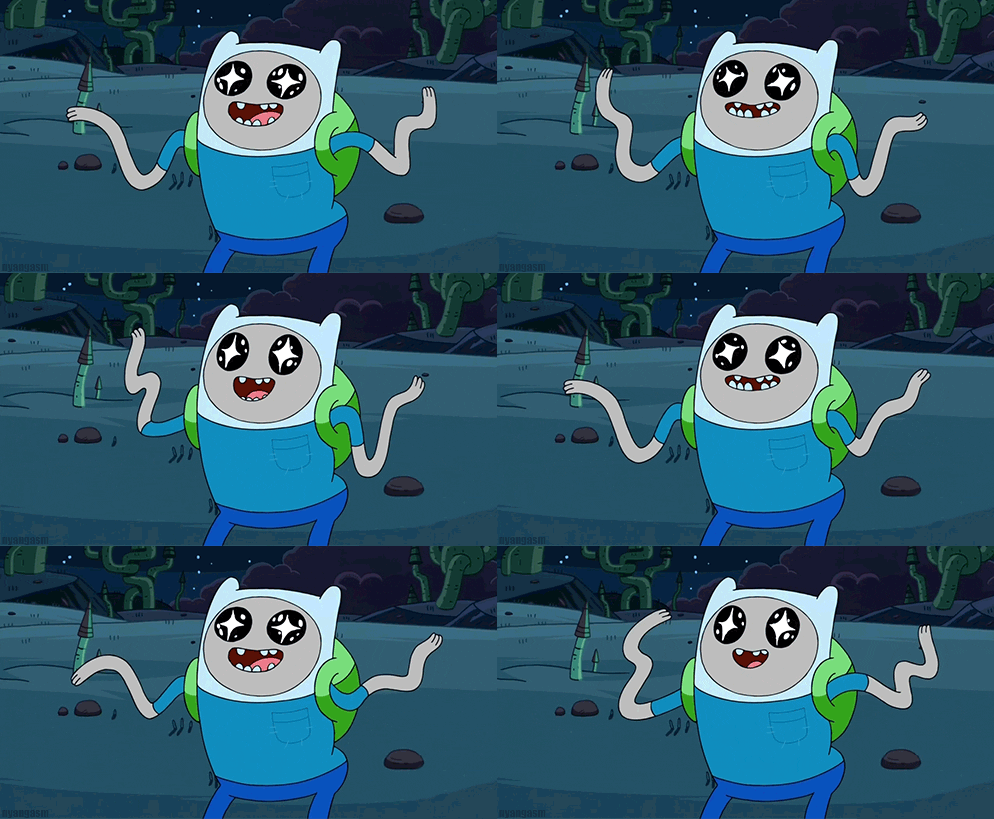
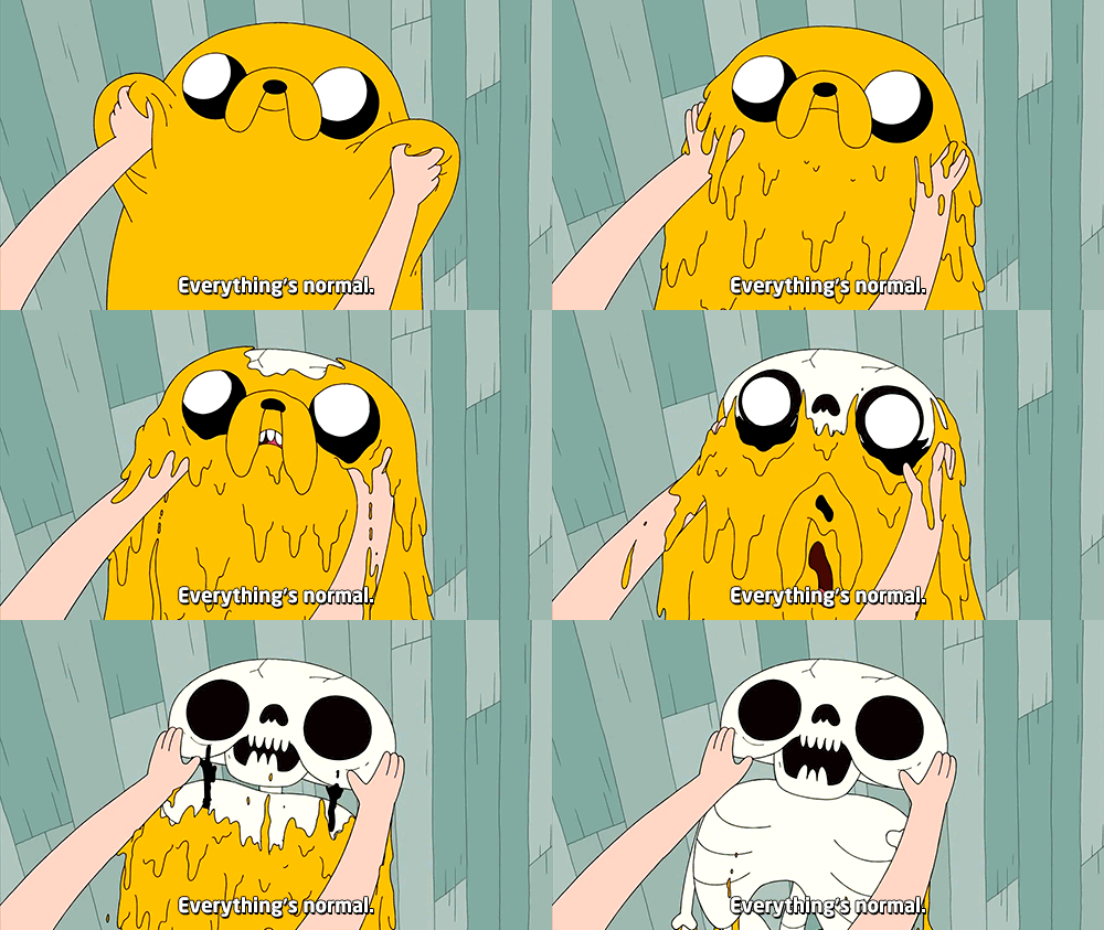
Podcast Themes and asthetic

Main Characters and Title:
Andrew and Garrett are the two hosts of Sweet Boys Podcast, they are joined by their mascot the 'Bone Spider' who sits in on each recording.
The title sequence for this podcast sets the scene with random trinkets around the room, stock video of cute animals and images of sweets. These aren't always topics of conversation within the show but set the scene as a calm and comforting setting - the music choice also reflects this.
I aim to create an intro sequence similar to this using a combination of animation and footage composed in After Effects. I may also experiment with adding a 3D model animation as well. When the title screen ends it will become apparent that the characters are sat in front of a computer. They will introduce themselves and proceed to choose a simulation to enter - based on the topic of conversation the simulation will compliment it.
Week 2:
Software Experimentation and Research
This week I added to my storyboards and tried to develop a look for my two main characters, along with a couple of colour sketches of other elements/objects. I also experimented on Procreate with a few different abstract background paintings based on those featured in The Midnight Gospel.
From my initial character sketch I was able to develop each character's individual look; I used reference images from different cartoons to work out how to create a character that can be quickly drawn in different poses/angles. I made sure to not include too many features/objects on the characters but to include important colours/clothing that relate back to Andrew and Garrett.
I have given Andrew's character a Finn (Adventure Time) style asthetic with long cartoonish limbs that are able to bend/move abnormally. I have rounded the head area and added his hair poking out the front. The original sketch also included headphones but I later decided to alter this and have Andrew's character be more robotic looking with small antennas and a record button. This also references his technical ability and editing skills.
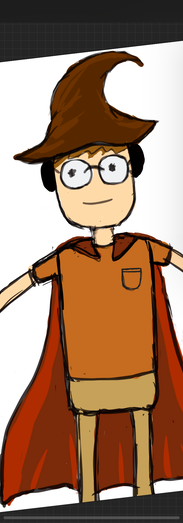
For Garrett's character I have tried to work with his loves of Harry Potter and Super Heroes to create a character that reflects his personality. He's more humanoid looking than Andrew to give some contrast to the characters, but will still show exaggerated movements/expressions. Most of Garrett's shirts are quite detailed so I've only adopted the colour scheme he usually wears. I am going to experiment with a few more colours and compare them.
Colour Experimentation, initial Storyboards for 1st episode
These images are my first ideas for the start of the first episode, they are much closer to the Midnight Gospel visual style but I found it hard to try and emulate the complex patterns and effects used. This lead me to study more Adventure Time style colours and themes while still retaining the concept of The Midnight Gospel.
Andrew's Character Expressions

Walk Cycle Practice


These walk cycles helped me to understand how movement brings a character to life. Each character has different limitations in their movements, as Andrew is part robot he is able to have more exaggerated movements and varied walk cycles whereas Garrett's character is human so will move slightly differently. I used this image for reference:

I tried to make sure I had secondary movements in mind when drawing my walk cycles, this meant adjusting the hair and antennas slightly for each pose to suggest a bounce/motion. I referred back to the 12 principles of animation throughout the project to ensure my characters were fit for use.


The same mouth shapes are used for Garrett's character although with more time I'd like to change these slightly to make them unique to his character. Throughout Garrett's design I considered adding a hat much like the Sorting Hat from Harry Potter (as a nod to his love for the films) and to make his character look closer to Clancy from Midnight Gospel but unlike a video game character, my cartoons ned to be easy to animate and not have too many accessories. The cape matches the colours of his jacket in real life and lobster shirt is enough to make him unique.
Background Painting-Using colour to set the atmosphere
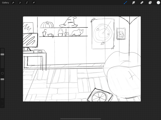
These are the backgrounds I have painted in ProCreate (iPad) using Adventure time's colour palates and drawing style for inspiration. I found that it was difficult to create the right perspective in advance for my characters due to my uncertainty of how they would be animated. As I have now decided on using Adobe Character Animator for most of the scenes I know that the characters will be staged in a foreground/midground position speaking towards the camera as opposed to walking through a scene (Once I am able to achieve this kind of animation well I would like to use it but currently I don't have the software know-how. I based Andrew and Garrett's home on elements of 'dream homes' they have spoken about liking (Spooky tower, fire pit, nature, modern touches).


The storyboards (above) were drawn out later than the original planned storyboards in order for me to have a more concise plan of what I needed to make in the time available. I decided that a channel trailer with short animated character clips and animated text would be achievable in the time frame compared to a few minutes of fully animated scenes with separated/reorganized audio clips.
I drew my storyboards in ProCreate (ipad app) using multiple layers, reference fonts picked out previously and written captions to remind me of the audio clip being used.
Animation Software Trials
I tried to use Adobe Illustrator to re-create my characters, I have to seperate the limbs by layer in order to isolate them for movements- this movement seemed too rigid in the end so I had to adapt my approach. I also found Illustrator a little restrictive when trying to recreate more complex shapes but with practice this will get easier.

The next software I wanted to use was Adobe Character Animator, this software along with Photoshop allows users to build their own puppet which can be rigged and animated via webcam, hotkeys and lip-syncs. After watching a few tutorials on how to set the blank puppet up and import my own images I was able to build my first puppet.
I had to continue this work at home over the weekend so brought all relevant files home on a memory stick- when opening the files on my own system they corrupted and crashed so I had to start again. This time I was able to set the character up slightly quicker from memory and made slight amendments on photoshop to the character's hands and torso/limbs. I was also able to separate the front and back of the cloak from my character in Photoshop to correct which layers overlapped.


I had an issue with Garrett's head not appearing in front of the scene background and was unable to work out why; this meant I had to move on to Andrew's puppet character to see whether I encountered similar issues and would have to find a fix.
In Character Animator I was able to download a blank puppet provided by Adobe which could be live updated in Photoshop/Illustrator, this is how I built both my puppets. The layer order for limbs, torso, head and mouth movements can be tweaked but this will affect the overall performance of the puppet in Animator. Once I'd imported all the separated elements of my character into Photoshop and arranged them I needed to rig the puppets. I also added in all the mouth shapes I'd made for the characters. I didn't make any sad mouth shapes as this seemed irrelevant at the time based on the content but if I had more time I would create a set.

I was able to watch a character being imported in layers from YouTube and triggers being added/fixed, however on my own character a few details differed like placement of limbs and mouth shape sets. I experimented with switching on different layers/mouth sets to find out how to control them but linking up the main body to stay together was the most tricky. I was able to create a basic rig for the Andrew Character but it would distort when moved past a certain point, changing the modifiers like draggability, stretch and fixed (pinned) points helped to fix this issue but I need t spend more time learning how to ensure the distortion is minimalized.
Video for reference: (2021Available at: <https://www.youtube.com/watch?v=JL024_E1AUk> [Accessed 16 May 2021].)
Test Exports via adobe media encoder

I encountered a few rigging issues while importing/setting up the puppets. This video was helpful in pointing out some common issues and how to fix them.
2021. https://www.youtube.com/watch?v=U1iXFxbWm0c. [image] Available at: <https://www.youtube.com/watch?v=U1iXFxbWm0c> [Accessed 17 May 2021].

I ended up drawing a few more last minute mouth shapes, hands and backgrounds for my animation in case they were needed. These all needed to be exported as png files/psd files to be used in Adobe Character Animator.

Final week preparations and planning to help me structure my days and work efficiently.
Hand Animated Elements
I decided to combine digital animation with my own hand drawn animated scenes to achieve the kind of aesthetic I was looking for. I like the polished look of digital animation but equally enjoy drawing and painting my own designs in a flip book style with rougher animation.
All of these clips are created on iPad in Flipaclip - this application has a simplistic MSPaint style functionality so I tend to import my Pro-create images in and manipulate their placement to create the illusion of movement. I then exported the finished 12/24fps clips as an mp4 for the main AE composition.
Audio and Lip Sync

Audio and Lip-syncing - I imported the audio from the downloaded YouTube video to Adobe Audition first as I shout I may need to trim the clips down and separate any background music but in the end I preferred to use the whole audio file uninterrupted to reduce any clunkiness and keep it flowing. The clip I chose ended up being really helpful to animate to as there were queues throughout to change scene/character position. I made sure to storyboard each segment to refer back to later on.

This screenshot shows me mid lip-sync with the characters; after importing all the mouth shapes and linking them up to my character (which took a lot longer than expected due to technical issues and ordering of files in Photoshop) I was able to add the audio clip in and compute a lip-sync with visemes of the mouth movements. These were a little off due to the amount of visemes created and sharpness of the audio/conversational tone and changing speed. I was able to manually change some of the mouth shapes though the timeline to better fit with the audio - I found it helpful to slow the audio playback to 50%/75%speed in order to be more accurate.
Final Composition
Before adding in all the digital animations and characters I decided to make a Pre-visualisation of the composition. This meant importing the audio file to AE and adding in storyboards/empty backgrounds for each section, this structure was really helpful and helped me to stay on track. I learnt this from watching an Adventure Time pre-vis on YouTube to try and study/work out the way episodes were created.
https://www.youtube.com/watch?v=9DT6fVChOb8
When my puppets were programmed with the correct lip-sync and movement pattern I was able to export them via Adobe Media Encoder with an Alpha in order for them to be positioned in my pre-made scenes. This was one of the final parts of completing the composition but I did make some other minor adjustments to layers and position/opacity keyframes before doing a final render/export.

I tried to stick to my storyboards but enhance certain elements like the story scene which uses a rain particle generator add-on and position keyframes to move the clouds. I also wanted to add in animated clouds in there scenes but due to timing deadlines they are static- after rewatching some scenes from Adventure Time they also use static clouds a lot which made me feel slightly better!
There is also a scene where the bone spider walks through the treetops carrying both characters on his back but this is very simply animated due to time constraints. I did manage to animate a rocket and turtle quickly in the time I had left but I'd definitely like to improve all these in future.
Final Product

There are 12 Principles of Animation (1981) to stick by in order for characters and objects to seem realistic. Disney's Ollie Johnstone and Frank Thomas advised that the physics of an object or character moving within a space should do the following:
-
Squash and Stretch
-
Anticipation
-
Staging
-
Straight Ahead and Pose to Pose
-
Follow-through and Overlapping action
-
Slow in and Slow Out
-
Arc
-
Secondary Action
-
Timing
-
Exaggeration
-
Solid Drawings
-
Appeal
I focussed on th appeal of my character when designing them to make sure they were memorable and could be easily drawn repeatedly. I tried to emulate secondary motion in my hand drawings as well as in Character animator using squash/dangle physics modifiers on the hair, antennas and cape for the characters. I tried to make sure I was making solid drawings and used curved lines where I could- I want to improve this though as it will be helpful when creating perspective/turning character scenes. I tried to stage the characters well in the scene but can experiment more with this in future, as well as exaddurated expressions and more fluid movements.


