
Context and research
I have researched several different Infographic videos that use 2D and 3D animations as well as text, sounds and music to convey a message or present data.

The Girl Effect - Alexnbc
This first video uses a combination of 2D animation and text to inform viewers on sociological issues and dangers involving girls growing up in poverty. Text is used instead of a voice over to communicate the message. (voice over is replaced by music to convey the tone changes throughout).
Yellow, red and black/grey are the only colours used and gives power to either positive or negative plot points of the video. For instance the word poverty is black/grey with a distressed effect and looks imposing, looming over the small character, it's also used for the creepy hands that chase the character later on - then turning to red symbolizing danger and blood...but later yellow is used to highlight more positive points like education, time and family.

What is Bipolar Disorder? - TED ED Youtube
This is a non-fiction video detailing the symptoms of Bipolar Disorder; this film opts to use a voice over along with various musical elements that work alongside the imagery on screen. Created by TED-ED for YouTube, the video uses basic shapes with bright bold colours to provide visual metaphors and make a complicated topic much more easy to take in. There's not much text used as the voice over is thorough enough to cover most points. Similarly to the first video (above) the colour black is used when speaking about the depressive episodes and then colour is added as positive notes are added. There aren't any statistics although the information provided is still factual.

Human Population Through Time- American Museum of Natural History
I chose to look at this video because it uses a combination of 2D and 3D visuals to communicate to the audience, the 3D sphere represents Earth with outlines of countries and seas. Areas of the globe change colour to represent the pattern of population movement and gradual growth over time. I would like to use at least one 3D model in my infographic to present a piece of data.
Principles of Animation
There are 12 Principles of Animation (1981) to stick by in order for characters and objects to seem realistic. Disney's Ollie Johnstone and Frank Thomas advised that the physics of an object or character moving within a space should do the following:
-
Squash and Stretch
-
Anticipation
-
Staging
-
Straight Ahead and Pose to Pose
-
Follow-through and Overlapping action
-
Slow in and Slow Out
-
Arc
-
Secondary Action
-
Timing
-
Exaggeration
-
Solid Drawings
-
Appeal
Each Principle Explained
Squash and Stretch
An object reacting to a surface or movement should stretch itself out becoming longer and thinner before hitting the surface and squashing down and outwards on impact. This is how we interpret the weight and mass of the form subconsciously while watching.

Anticipation
Anticipation refers to a character's 'wind up' movement or preliminary action before actually moving, an example of this would be in popular Hanna Barbera cartoon Scooby Doo when characters are so scared (usually when a monster appears) they run on the spot building up speed before actually running away- this enhances the movement and makes it more comical.
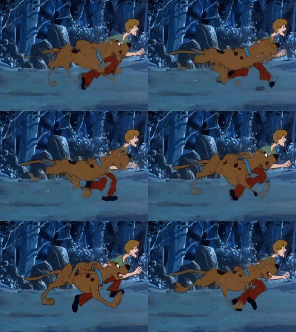
Staging
The staging and composition of a scene ensures the viewer's attention is drawn to the right places at the right time to follow the storyline. Viewers also connect better with characters when they can see their expressions so characters don't always face each other directly, instead both facing forward at an angle towards the screen. The character should show 'clear intentions' of their action so audiences can follow easily.

Straight Ahead and Pose to Pose
These terms refer to two different styles of animating, Straight Ahead means each frame is drawn in turn with no set end point whereas Pose to Pose animation is more structured with a start middle and end point to work towards, adding the filler frames afterwards. Straight Ahead is generally used for fluid actions and movements and Pose to Pose used for more precise, intricate or dramatic actions.

Follow-Through and Overlapping Action
Follow-through action describes the residual energy after a motion is performed, for instance when a character is running and then comes to a sudden stop their body will continue to move and readjust until stable. Walt Disney even used this principle when making animatronics that looked more 'natural' in their movements and less robotic. Overlapping actions are those of external components like hair, ears, clothes, tails or even props that are connected to the main component, these will move and react differently due to 'drag' and weight.

Slow In and Slow Out
As an object accelerates it picks up in speed until reaching terminal velocity before slowing back down to standstill. The way to re-create this in animation is to draw more frames of movement at the beginning and end of the sequence with fewer in the middle. When played back it should look as if the object has sped up and slowed down rather than dramatically starting and stopping which is far less realistic looking.

Arc
Most limb movements and gestures made in real life naturally form an arc, artists try to ensure they replicate this when animating to make movements feel more fluid and natural. a good example of this is Mickey Mouse in Disney's Fantasia as he needed to match conductor style motions and pacing of the music.

Secondary Movement/Action
Secondary movement describes any follow up motion after the initial move, this is used to keep audience's attention and reinforce the main move. It is a good chance to reaffirm a character's personality and mood as well as lining up the next part of the scene (a reaction shot from another character possibly).
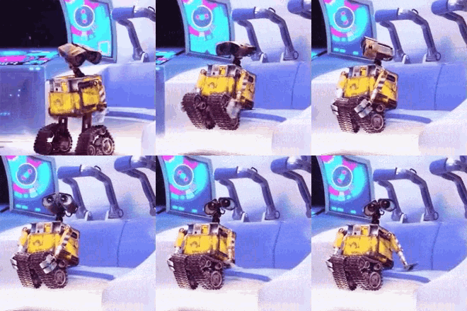
Timing
One of the most important things in both live filming and animation is timing, in order for the animation to be believable the timing of actions and reactions needs to be as close to life as possible, this means that a door opening, an object falling on the floor or a character moving must match realistic timing unless it's intentionally slow/fast.
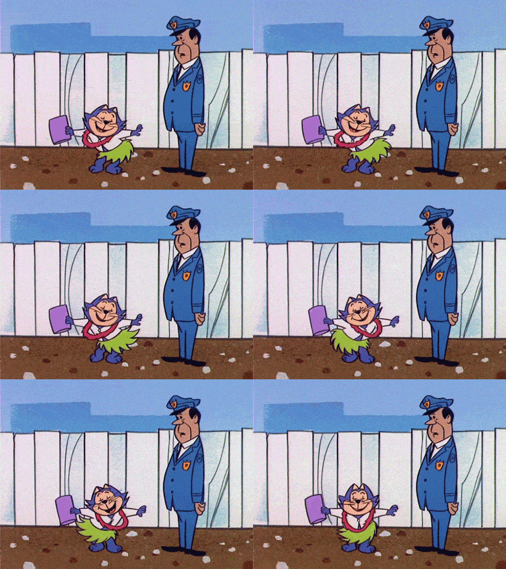
Exaggeration
Although most of the 12 principles are regulating the 'realism' of animation, this one is about exaggerating important movements and expressions to keep viewer's attention and express the gravity of a situation. This is used at important plot points of a story to ensure the character is showing how they feel, although every dramatic expression or action must still suit the character and revert back to normal after use. Constant exaggeration and distortion of expressions makes it harder for audiences to connect to over time.
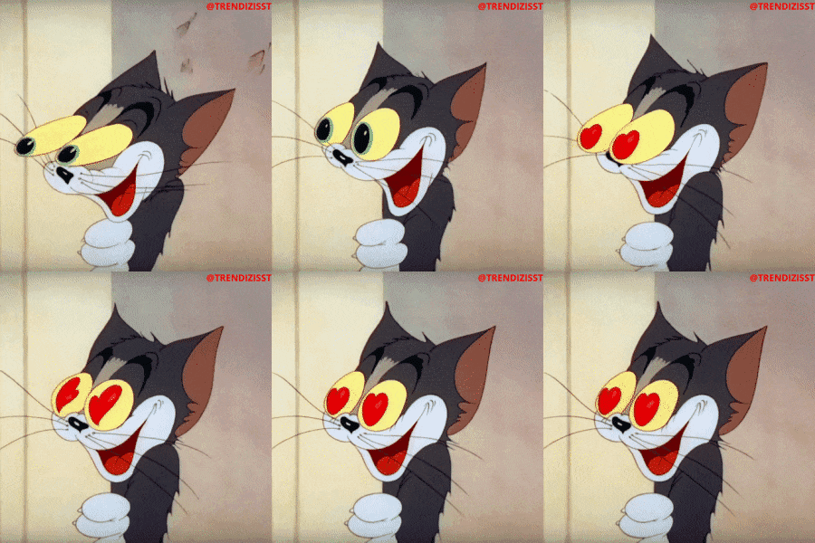
Solid Drawings
Although many animation are two dimensional, it's a good idea to draw characters from a few perspectives. (this will also make staging easier) The solidity of a character agaiun contributes to it's realism as well as giving animators an idea of the weight/mass when they are moving them.

Appeal
The appeal of a character doesn't always relate to how cute/attractive it is but how satisfying it is to watch, animators will come up with many mock-ups of a character before deciding on the right size for their facial features, height and weight, general geometry and movements. Often as a tv series progresses you will notice a rounding off/polishing of their features to improve their appeal. Generally characters with the most personality and easy to draw/remember features work best!


Types of Animation
2D Animation
Traditional 2D hand drawn animation has been used to tell stories since around 1908 (Emile Cohl's short film Fantasmagorie). Individual 'cels' were drawn out and photographed before being played back to give the illusion of a moving scene. The process of hand-drawing every frame has developed over time and been tweaked/adapted to save animators time and to produce a more imaginative end product. In 1924 brothers Max and Dave Fleischer produced the first animated film with sound 'Oh Mabel', followed shortly after in 1928 by Walt Disney with 'Steamboat Willie'. This film included a musical soundtrack with Mickey whistling along and bopping along to the sound.

Walt Disney and his team went on to invent the Multiplane Camera; this device would allow animators to layer background and foreground elements with characters to give the illusion of depth. Animators could control the distance of each plane to the camera- changing its scale on screen. Artists would paint with oils onto large glass plates which would be inserted on different levels within the frame, the entire scene could be viewed from above and lined up correctly before filming started. Static elements like the moon could be fixed in place while characters were moved about on the various planes, the first short film to be produced with this method was called 'The Old Mill'. After years of practice and development the Disney company released their first feature length film 'Snow White and the Seven Dwarfs'. This picture won an Academy honorary award in 1939 and was treasured by young and older fans alike. In order for animators to recreate lifelike poses for characters a technique called Rotoscoping was used (first developed by Max Fleischer in 1915). This enabled animators to trace over live actor footage frame by frame, giving their drawings an improved sense of motion, this technique has been adapted over years and is still used today in modern visual effects to add characters into scenes.
Walt Disney went on to combine 2D animation with live action in 1964 with the release of 'Mary Poppins', another milestone on the animation timeline.
Some of the finest uses of 2D hand drawn animation in my opinion are made by Studio Ghibli, founded by Hayao Miyazaki and others in 1985, this company has produced many different animations. Some are inspired by traditional fairytales, others have deep connections to love, nature and morality and are usually made up as they go along, the visuals are painstakingly re-drawn hundreds of thousands of times and use of colours, motion and composition outshine many other animations.

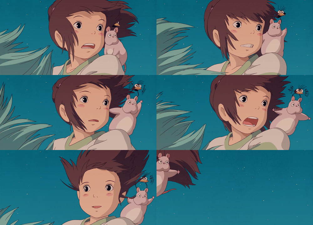
Due to the amount of drawings needed to make up a feature length film, facial features and forms were intentionally drawn simply, if animated well this did not have a negative impact on the viewer's understanding but meant that characters weren't very photorealistic. Thanks to digital drawing software like ProCreate, Paint, Adobe Photoshop and other programs, details can be more fleshed out and copied frame by frame in a much faster process allowing for more detail to be included without sacrificing as much time. Some artists still prefer to stick to hand drawn animation despite the technological advancement to keep their films consistent.
(I have digitally sketched a couple of characters from various Ghibli films (left) on ProCreate for ipad).2D animation can also be achieved in open source software like Blender in the grease pencil mode.
3D Animation
As computers improved artists were able to start modeling three dimensional characters and sets, the computer division of Lucasfilm produced a short animation in 1984 called 'The Adventures of André and Wally B' which showcased basic 3D cartoon characters interacting in a space. (This division was purchased by Steve Jobs in 1986 to become standalone studio PIXAR - See Catmull and Parke). The Walt Disney Company later made a deal with Pixar to create a feature length film using this new 3D technology, the result was 1995's Toy Story. Director John Lasseter won a special achievement award for the application of techniques used to create the film which has since paved the way for all future 3D animated films. Of course in the 90's computer technology was far from speedy so animated films would need continued innovation and development to create more realistic/detailed films.


Motion Capture and Software Development
Since rotoscoping was introduced back in the 1930's to mimic live actor's movements, animators and film makers now had access to digital 3D modelling software and wanted to achieve similar result in their computer models. Motion capture software was developed to take physical reference point markers of movement on a subject and translate them into digital code that could be programmed into a 3D digital model. in 1999 Lucasfilm introduced the world to the first full motion capture animated character Jar Jar Binks, despite fan opinions of the character and this was considered a huge achievement and proved that digital 3D characters could be supported by live actors in motion capture suits. The Polar Express and Monster House are both examples of fully animated films made using motion capture, although there was many more live action films that have featured digitally animated mo-cap characters, these include the Disney Marvel Franchise, LOTR (Andy Serkis as Gollum), Ted (Seth Mcfarlane 2012).
3D modelling softwares like Blender and 3DSMax
are now easily accessible to the public which means
that more independent/student film makers can learn
how to create and animate their own characters.

Motion Cycles
Animators keen to cut down on time and keep continuity in their character's actions will create motion cycles of the key poses in a motion, motion cycles are generally used for activities (walking, eating, dancing etc..) that can be repeated to show the desired movement. This process ensures a level of consistency in a character's movement style and can be customized to fit other characters.

Kinetic Typography
It's likely that most if not all animated features have some form of title/credits text, this is generally animated in some way to perform a transition into the show/film. Other examples of kinetic typography could include the 'news ticker/crawler' which is the banner that runs along the screen updating viewers with new headlines, also used in live televised events like the Olympics/sporting events or award ceremonies. Most Pixar films incorporate kinetic typography and animation into their end credit screens to thank viewers for staying to watch them.
2D to 3D Games Development
When early games were released on consoles from 1980's onwards the graphics were only two dimensional and very basic due to the few pixels used and limited processing power available at the time. Characters like Super Mario were 8bit coloured squares that followed a 2d background in sidescrolling adventures through different lands, while some early 3D games like the 1980 Atari release 'Battlezone' that used basic line art to give the illusion of 3D tanks and background elements. This was deemed so realistic at the time that the US army used it to train their tank gunners.


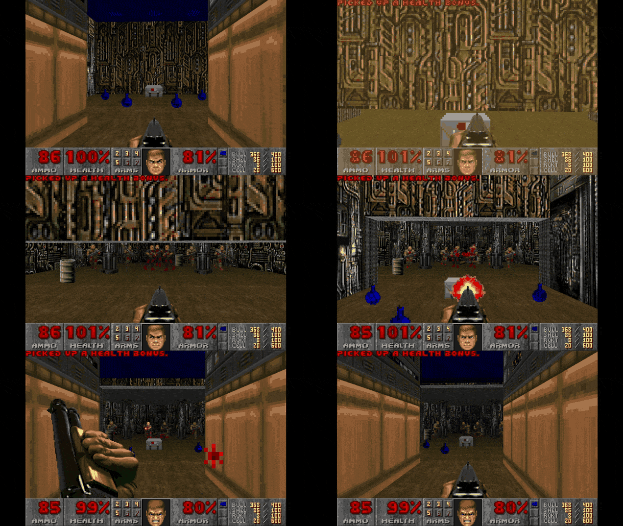
By 1993, Doom, Quake and other early FPS games were able to simulate a full colour 3D environment and enemies, accompanied by an eerie soundtrack and haunting environments, this game quickly became iconic and is still played by many today (Has also been remade several times with sequels).
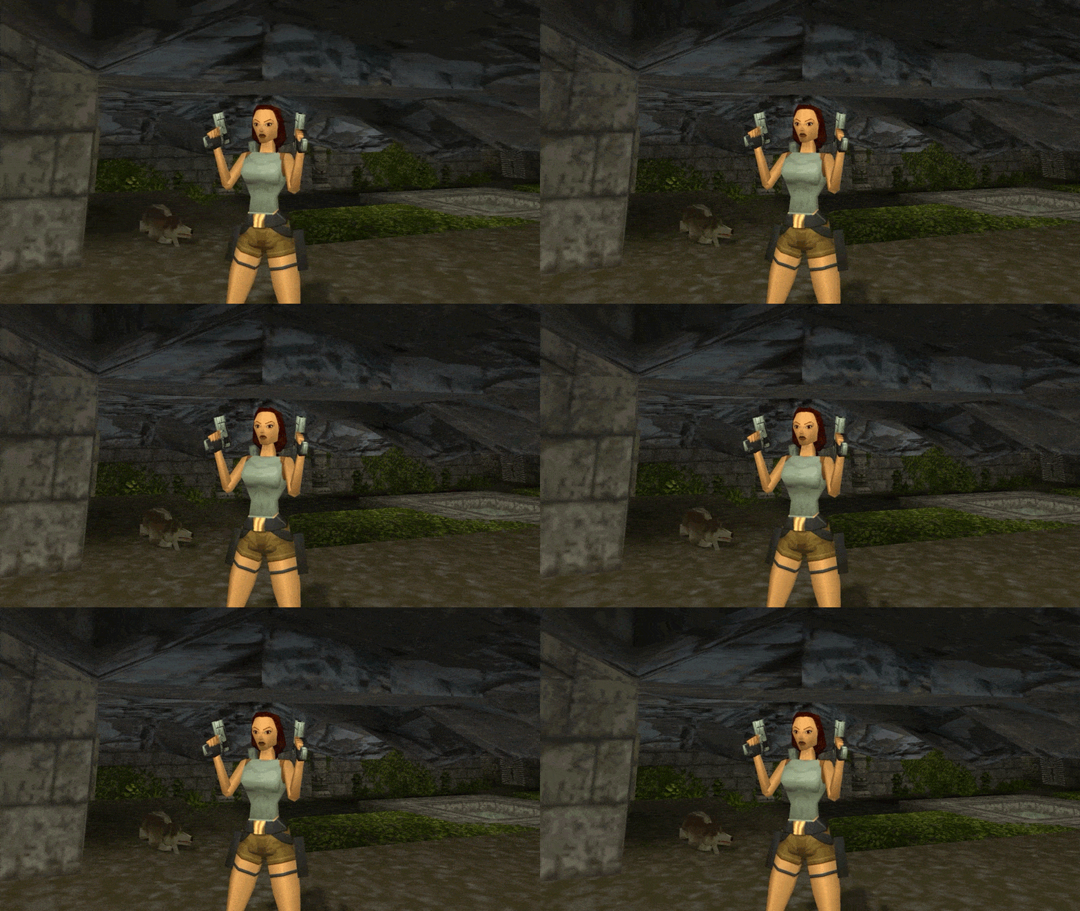
In 1996 Tomb Raider was released on PlayStation One and PC, despite her exaggerated pointy physique and rigid movements she inspired a while franchise including films and many more games.
By 1997 Square Enix had released Final Fantasy 7 on PS1, a huge saga spanning three separate disks! This game incorporated detailed and pre-rendered cut scenes throughout to breathe life into the basic looking characters, engaging players and helping to set the scene for each level.


Building a 3D Model
To create a 3D character that can emulate lifelike motions it must have a skeleton and muscle tissues like us, this ensures any movement it makes is within the constraints of real life -making sure it's believable and more realistic to the player. Much like a stop motion figure the first element a modeler constructs is the wireframe rig, this will contain all the joints needed for movement. It also involves linking up the parent and child parts so actions have reactive movements (leg and ankle or knee and shin etc...) The more precise the rig is, the better end result. One of the first examples of a functioning skeletal rig in animation is Luxo Jr (Pixar 1987).
The rig can be programmed to perform a set of functions based on the game parameters - NPC or non-playable characters will have a built in code to react to the environment and main character in set ways.
There are several different ways in which a rig can perform, the two main animating styles are Forward and Reverse Kinematics.
Depending on whether the rig is for an in-game character or a pre-rendered cut scene or film/tv show character they will differ in complexity. As game character move on command in a live scene they are generally a bit more basic so the game can run at desired speed. More complex rigs are used in pre-rendered cutscenes as they don't need to be live rendered and moved by the player so can be a lot more detailed.
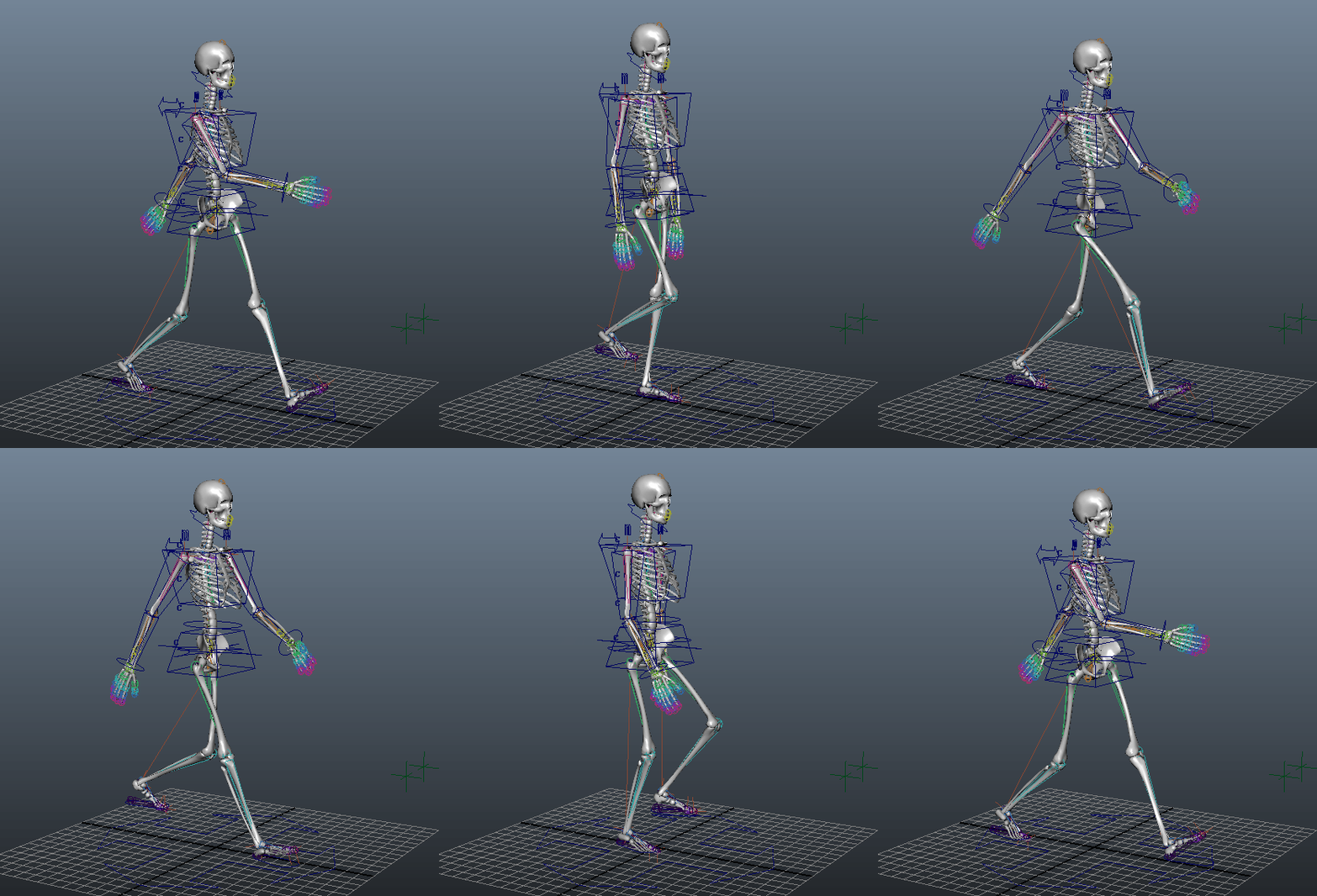

Kinematics and Rigs Explained...
Forward kinematics rely on an animator's ability to coordinate natural movement based on their understanding, each joint is moved in turn to complete an action, this can be quite a lengthy process and sacrifices legitimate mathematics/physics.
Inverse Kinematics work by letting the software predict and place movements based on the limits of each joint and its parent/child joint. The animator provides a point A and B and the program will work out the best way to get there. The only limit to this is when a character needs to make an unnatural/exaggerated motion which doesn't make sense to the program, it cannot use imagination/free movement to complete the task and can break/glitch.
Uber-Rigs are sometimes built by games developers to try and anticipate every type of movement needed in the game, however this isn't particularly time efficient and will generally need tweaking and changing as problems arise.
Modular Rigs work a little like the motion cycles used in animation, they are libraries full of character specific movement patterns rigs for separate body parts. these can be switched out easily for different movements.
Freeform rigs are being used more often as they give animators more control, parent and child links can be separated and changed at will, this means the glitchy and unnatural counter animation movements are avoided where possible.

Motion Capture in Games
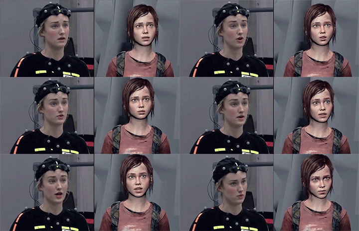
In modern games motion capture has been used to help games developers emulate lifelike actions through rigs in a simulated environment, the example above is from Naughty Dog's The Last Of Us (2013). This developer also sued the same technique for other productions including the Uncharted series and The Last Of Us 2.
This works especially well on facial rigs, lifelike expressions are notoriously hard to create from scratch so actors wear motion capture dots which animators can line up with a digital rig.
Rendering a Sequence
When developers have completed the 3D scene it needs to be rendered, this means the sequence is flattened into a 2D piece of footage ready for viewing. The viewport camera 'films' the sequence and saves it for playback, the animator can change the angle, distance and composition within the software depending on what is needed. Software like Unity, Cinema4D, Unreal Engine, Maya and 3DSMax are commonly used for staging of 3D assets in scenes.
There are different effects and textures that can be added to a render to give a different finish, for instance Borderlands is more of a stylized render whereas Assassins Creed is more realistic looking. Of course there is a noticeable difference between pre-rendered (offline) sequences and in-game footage, the gap is being closed as faster processors are used in consoles and PCs for Realtime in-game rendering but fans have previously been disappointed watching a high quality game trailer only to load the game up and see a far less detailed environment/characters. Unreal Engine is at the forefront of live lighting making any environment come to life in real time as a player explores it. Typically PC gamers have access to higher spec graphics cards that can handle the power needed to show off the best graphics.
For pre-rendered sequences developers often use render farms, these purpose built computer farms are able to 'farm' or process huge amounts of data at once that a single computer would take decades to do.


Pre-Visualization (Pre-vis)
Pre-vis sequences are very basic renders of a scene for use by developers/directors to make sure a sequence is lit correctly, composition is correct and characters perform the right actions. They are likened to a digital storyboard visual and can be annotated/taken away to be updated/tweaked where needed. it could be used to show a client/production company or for internal use as a guide for a fast paced action sequence. It will only illustrate the key movements in a scene and lacks important details needed in the final render.
Below is an example from The Mandalorian (Streaming on Disney+).

Lighting Types
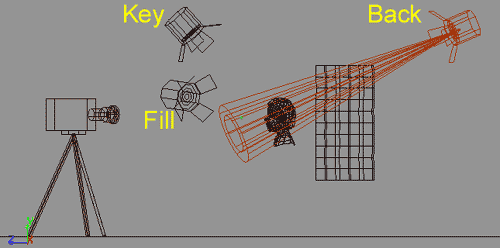
SkyDome lighting is the most natural, the scene is lit from above to emulate natural daylight; global illumination is similar as it measures the direct lighting but also incorporates reflections and light bounces/refractions from other surfaces. The 3 point lighting technique is used (much like in film/tv) to portray realistic direct lighting in a scene. Darker scenes often conceal more basic/simplistic graphics and texturing whereas bright outdoor scenes can reveal more inconsistencies between assets and their environment. I portray accurate lighting 3 separate lights are inserted into a scene, a key light, fill light and backlight (see diagram below)
3D Modelling Context
A Quick History Lesson
3D drawing and modelling has been in use for centuries - Leonardo Da Vinci composed several 3D plans and sketches for his works!
In the 1600's French philosopher and mathematician René Descartes developed the Cartesian Coordinate System which allowed co-ordinates to be plotted and located in a space/location. This meant that 3D sketches/models should account for all 3 Axis X,Y and Z. The coordinates allowed a 3D object to be replicated on paper with mathematical precision. Modern software like Blender and 3DSMax work within a grid marked by an X,Y and Z axis.
Later on in the 18th Century, James Joseph Sylvester came up with Matrix Mathematics, this ensured that lighting and reflections were replicated correctly according to the mathematics of light in nature. Thankfully modern software uses complex calculations based on these principles to accurately light simulated objects within a space.
The first systems purpose built to assist us in 3D modelling were used for aeronautical/automobile engineering. These early CAD (computer aided design) consoles (1960's) were extremely basic and could only be used in a handful of different ways, all relating to the specific job they'd been built for. Computers were not readily available and nearly as adaptable as they are now meaning that 3D design only progressed and grew in very specific sectors of design. Models needed to be exact as the parts would be produced for mechanical use which could be achieved with minimal human error through the CAD machines. Sketchpad (or Robot Draftsman) is an example of an early program used from 1963 onwards. See right an image of Ivan Sutherland (creator) using the program.


In 1972, ADAM CAD was released, this updated CAD software was commercially available and would be used by more and more engineering sectors to aid design and production of parts/machines. An updated program named CATIA (Computer-Aided Three Dimensional Interactive Application) was also released in 1977.
At a university in Utah in 1972, Edwin Catmull and Fred Parke (background in aeronautics and engineering at Boeing) produced a short film titled 'A Computer Animated Hand'. This was prompted by Catmull's love of animation and aspirations to work for the Walt Disney Company, he later went on to co-found Pixar Animation Studios! They were able to convert hand drawn vertices (literally drawn on a hand) into a digital form using precise math.
Also at the University of Utah around this time, Gourand and Phong had developed 3D shading techniques to mimic light dispersion, they showcased this on a 3D teapot model as this had many curved faces and shadows. It's now a common model in many 3d programs to test shading and lighting.
By the 1980's UNIX workstations and IBM PCs (1981) were developed and commonly used in the engineering sector (cars, planes etc..). Two programs named Romulus and Uni-Solid were also released around this time, these allowed designers to see a solid preview of their design which was a great advancement at the time.
AutoCAD and Autodesk were introduced the following year in 1982, these systems could be used on IBM PCs and therefore dominated the CAD market for years to come, winning PC magazine's 'Best CAD Product' for the next decade.
Pro/Engineer software was released in 1987, this was a more solid/3D focused program that could run on UNIX workstations and used parameters to build a form with better looking volume and depth. Unfortunately training costs and processing of different file formats at the time meant that it couldn't totally replace AutoCAD.
in an attempt to compete with Pro/Engineer, a variety of CAD software add-ons were developed for use and marketed to engineering firms. As this kind of software became more commercialized, companies were keen to copyright and buy CAD-made plans for their own use. Boeing used CATIA to design their 747 Aircraft in 1988.
As PCs gained processing power in the 1990's, more 3D CAD software became available to the masses and those using UNIX workstations slowly made the transition to PC. Many different sectors now had access to these systems and along with other technological advances like the Internet the software continued to be updated and changed to keep up with demand.
By the 21st Century, CAD was available in schools and many commercial businesses and across Windows, Linux and other platforms. CAD has since been used in fashion, motorsport, entertainment, 3D animation (See 'PIXAR's The Adventures of André and Wally B'), medicine and civil engineering.
Today open source programs like Blender and 3DSMAX (Autodesk) are available to the public and anyone can create their own 3D models with a little practice. 3D Printing, another technology that has developed from CAM (computer aided manufacture) and is now widely available for purchase. This used to be purely for industrial use but is now used for printing out 3D art and models that have been designed and built within 3D software used in VFX and games development.



3D Modelling Terminology
Types of Modelling
Solid Modelling (Boundary Modelling, Representation or B-Rep) - this means using solid 3D shaded models to define depth or volume, generally used in engineering for CAM.
Shell Modelling (Surface or Facet modelling - This is only a representation of the surface of a model, in reality would only be an egg shell layer of textures and surface, usually used for video game/tv/film characters.
Wireframe Modelling - This is a mesh-like frame or skeleton model of an object, defined by it's vertices (lines and arcs).It doesn't have opaque sides.
Modelling Techniques
Polygonal Modelling - This uses triangles or 'polys' to map a surface, each poly is modifiable and can be manipulated by the user. An object may start as 'low poly' but more polys can be added to the model where details are needed, similarly if there is a joint that needs to move there must be more polys added. Subdivision surface modifiers can be used to keep render times low but increase poly counts in certain areas. A lot of poly software uses symmetry to ensure oppositional polys match each other, this goes against one of Disney's traditional animation tips-that characters should be slightly asymmetrical to seem more realistic looking or believable.
Spline Modelling - Splines are a collection of straight lines in varying length and angle that together define the shape of a curved object. These lines are extruded along each axis using a lathe tool until the 3D shape is formed. This is sometimes called a sweep/spin tool in software like Blender.
NURBS (Non-Uniform Rational B-Spline) Modelling - NURBS allows the computer to calculate the shape and curve of a 3D object, the final object is built up of oblong panels that connect by control points on every corner, these can be manipulated one by one or as a group (A group of NURBS is called a Patch). This kind of model cannot be UV Wrapped unless converted to polys first.


Contemporary Commercial Uses of 3D Digital Animation

Orlov- Created for Compare The Market


As 3D modelling and animation has become more accessible to artists and creators, the demand for both realistic and stylized animations/models has grown massively. Television adverts generally feature kinetic typography and screen transitions at a minimum but usually a digital 'mascot' is added to help the audience remember the company that is being advertised. There is also a market for merchandise based on characters found in adverts as they generally appeal to children as well as adults. The advert animations are pre-rendered for use in adverts on television/online and so can be very detailed, marketing teams are able to input ideas for the look and feel of the character (They must have appeal as there are there to make an impression and ultimately make sales). The characters may be 'future-proofed' so animators can alter them for extended/future adverts, saving them time and allowing for continuity/memorability of the brand associated.
Another example of 3D models being used is in video games, many loved characters from older games on PS1/Nintendo/Sega in 1990's etc.. were two dimensional and couldn't be very detailed due to the space allowed on disk (and processing power of consoles/PC at the time). In newer remakes/sequels of these games, the development teams have had to remake the characters in 3D with an appropriate amount of detail for the console it will be played on, newer consoles like the PS4 and Xbox One are capable of live rendering lighting and shadows, full interactive environments and multiple characters. The main challenge is upscaling the characters to meet expectations of the player (who may have a nostalgic and sometimes biased memory of the character's feel). Iconic games like Crash Bandicoot have managed to keep the same feeling of original games while bringing the visual in to the modern era. There are sometimes other challenged like the original studio not producing the remake (Originally Naughty Dog but passed on to Activision). This is why concept art is still ever important to capture the correct aesthetic for a character/game.
Final Fantasy 7 is another good example of a remade game that was able to capture the feeling of the original game and characters while visually upgrading/altering the format. Games engines like Unreal allow for lifelike raytracing lighting and camera movements that involve the player and make the game feel more cinematic. Cut-scenes are now almost seamless from gameplay and load times are significantly reduced. Eevee rendering is likely used in these games to improve load times.
Music videos are another medium that frequently use visual effects and 2D/3D animation to express meaning in the songs and allow listeners to get a glimpse into the artist's mindset/imagination.
For example Kanye West's Album Graduation featured digital comic book style cover art which was carried through into the first song 'Good Morning', this music video (2009), a bear character personifies the artist and is shown acting out a storyline of the song.
Similarly the band Gorillaz has chosen to create a virtual band using 4 characters which were originally 2D and developed their personas over time alongside the improvement of VFX. Their early album Demon Days (2005) featured music videos for Clint Eastwood, Feel Good Inc, Dirty Harry etc.. that were all predominantly two dimensional animations but in the later album Plastic Beach (2010) another dimension was added to their music videos and the inclusion of live actors with the 3D characters added to the belief that the Gorillaz were somewhat real. The video Stylo is a great example of this, another notable mention is the music video 'Do Ya Thing' (2010) which still holds up a decade later as an amazing piece of 3D animation for a music video. Another song from the same album called 'On Melancholy Hill' features both 2D and 3D characters interacting together in a 3D scene. (Animation created by Passion-Pictures for Gorillaz). All the music videos are pre-rendered and can therefore include a lot more detail than a video game that needs to live render the scene as it progresses. Software like Nuke is used to compose various CG and live elements that can be manipulated with nodes to blend together within a scene, other software like Maya, Cinema 4D and Blender could also be used to combine various elements into one piece.


Clint Eastwood, Stylo, Melancholy Hill - Gorillaz
Crash Bandicoot Series PS1-PS4

Zingy- Created for EON Energy


Graduation Album, Good Morning - Kanye West
Final Fantasy VII Original vs Remake


